i had been in the store enough times and scoped out all their sample invites so we had a pretty good idea of what we wanted (and didn't want), so mainly what i was after was some help in calculating just how much of what i was going to need. and she was fabulous in that regard. and, happily, she didn't try to push anything on us. there was no trying to convince us that we needed envelopes for the reply cards (we went the postcard route) or coordinating menus and programs and seating cards. don't get me wrong, there were some absolutely gorgeous displays of weddings they had done where ALL the paper was coordinated but i shudder to think of the fraction of our budget that would eat up. so we came away with about $250 worth of paper, and the estimate that to have them printed there would cost us close to $700.
here's what we've got...

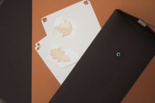
the left is the chocolate brown cardstock that will be the invitation base. the orange is actually a metallic copper that i am in love with and (along with some ribbon from joann's) has inspired a good deal of my color scheme. the cream is going to be the portion of the invitation with the text and the corners will have the leaf cutouts. i can't decide which of the two corner punches i like better so i may end up doing half of the invitations with one punch and the rest with the other. there will just be a tiny border of copper around the cream and then it will show through the leaf cutouts. the larger leaves are gold stickers from good ol' martha stewart. not exactly sure how we're going to work those in yet, but at the moment i'm thinking maybe at the top of the invite above the text. the picture is kind of dark so i don't know if you can tell, but the other brown thing is our envelope. its long and skinny, and it has a tie closure like those memo envelopes you have in offices. for some reason i just really liked that so i thought, what the hell. that's actually why the invite changed from square to tall and narrow.
i have a bunch of other crafty wedding pictures to post as well, but those can wait for another post.
No comments:
Post a Comment