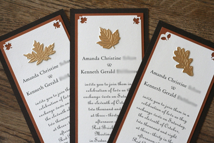
the specifics... chocolate brown cardstock with metallic bronze and cream colored cardstocks all purchased from a local paper shop. the corners were cut with a fiskars corner punch. the text was designed in photoshop and is pretty basic, and the gold leaves are stickers from martha stewart's website. i love them.


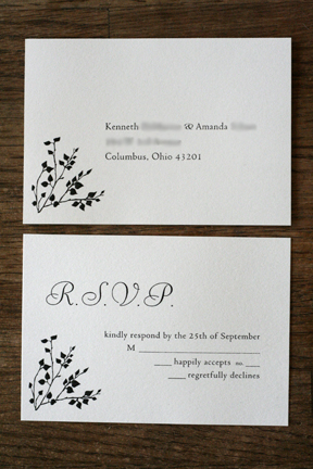
the rsvp's are postcard style and are the same cream cardstock as the invitations. they are kind of plain and i'm not absolutely thrilled with them but i'm happy. i just wish we'd been able to put a little color on them. but no biggie.
aren't they all lovely? punching the corners and gluing will probably get old after a hundred of them. but for designing them ourselves and putting them together, i think we did a darn good job.
2 comments:
wow, very professional! maybe you should go into the invitation business...
let me know if you want some help with the invites!
Post a Comment